Bloom Robbins
Visual identity design for a hair vitamins and supplements brand
Visual identity design for a hair vitamins and supplements brand
Bloom Robbins, a Slovak manufacturer of nutritional supplements, has approached us for the second time. Years ago, we established cooperation with the original Bloom Hair brand by creating a visual identity, e-commerce, and product design. Since then, Bloom Robbins has significantly enriched its product portfolio and the brand was in need of a fresh start. This time, the client approached us to help with a new visual identity.
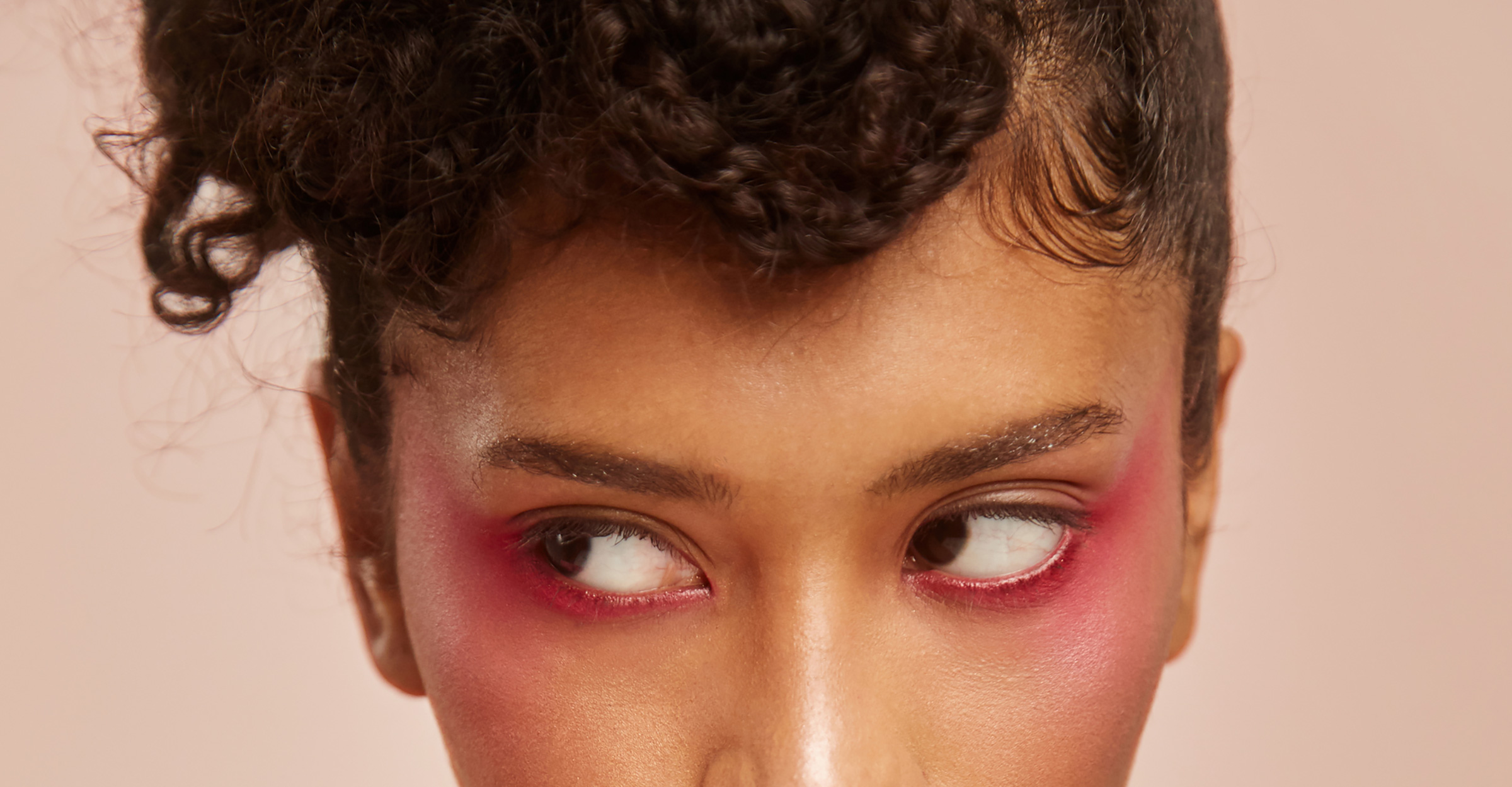
The main pillars of the new brand identity of Bloom Robbins are the keywords Wildness, Femininity, and Playfulness. We adopted these three terms and used them as the main foundation of the new visual identity for nutritional supplements for women who want to feel beautiful, healthy, and sexy at all times.
Every woman is a variety of personas – sometimes a little playful, other times determined and bold, or sassy and sexy. Bloom Robbins is a heroine who combines all of these elements. She is every woman’s story.


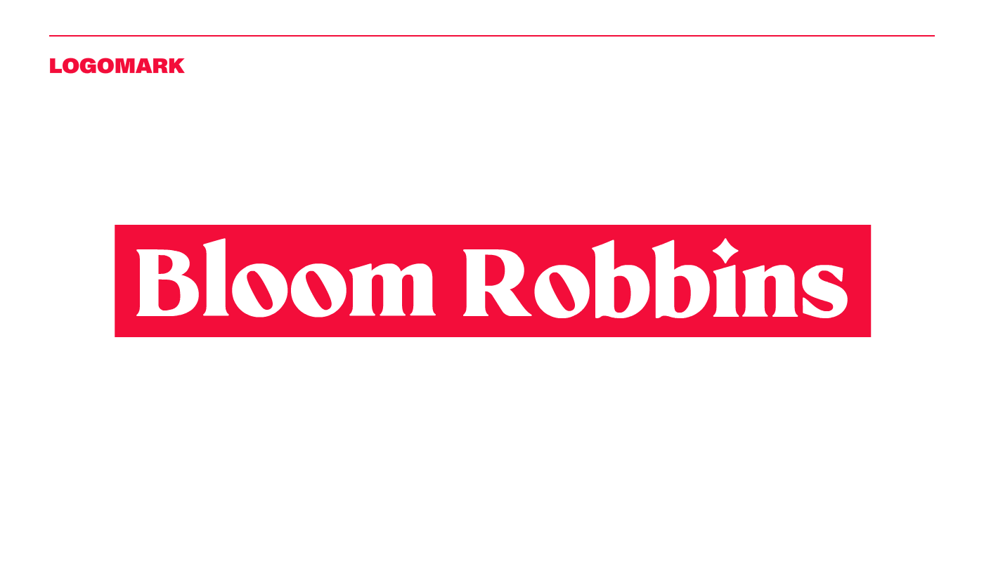
The sound of the name Bloom Robbins should slightly evoke a heroine’s name, so the typographic logo was an obvious choice. From a myriad of concepts and fonts, we chose one that looks unconventional and playful, yet feminine and elegant. The logo became a good foundation on which we built the brand’s visual identity.
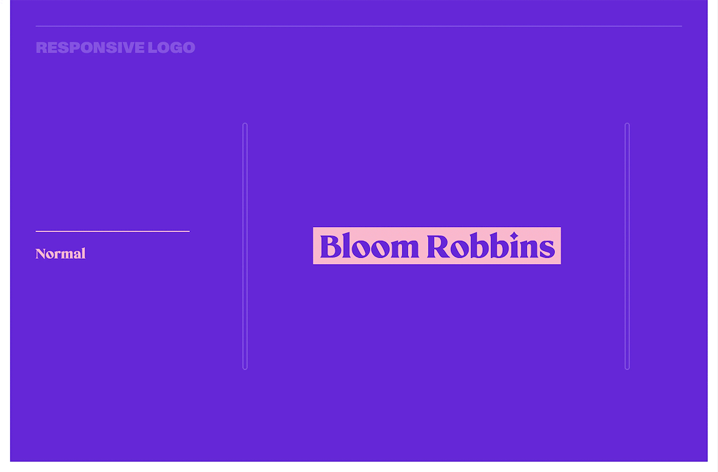
The logo can be displayed in two variations. The original primary variant features a colored background mask, making the logo more distinctive and enhancing contrast on different colored backgrounds.


In order to highlight the connection between the key pillars of the identity, we decided to use two different typefaces from two different styles. On one hand, the softer serif font Mikela looks both feminine and playful, and on the other hand, the edgier, more alternative, and bold font Monument Grotesk, which adds a touch of fierceness. The interplay between these two versions of the fonts is further underlined by the colour combinations in which they stand out.

As the main colour of the brand, we have chosen a deep purple, which on one side is not a cliché girly colour, but nevertheless has a rather feminine feel to it. We see it as a suitable compromise that, when used with other colours, underlines the brand’s distinctive character.
However, the brand needed a large range of different colours that were distinct enough to represent the different product lines. The overall palette is made up of some very rich and bold colours, but also more subtle shades so that we could create many possibilities for its use.


