Ostrolucky
Branding and Website designed by Nature
Branding and Website designed by Nature
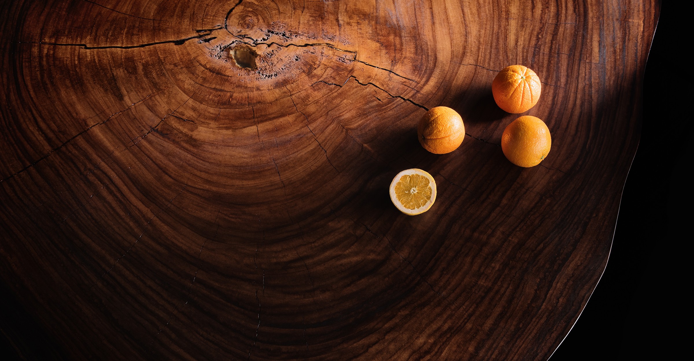
Inspired by the feelings of respect and admiration for the creations of nature. Ostrolucky, a newly established brand, aims to make an impression with its perfectly designed, live-edge original products. Founded by Milos Ostrolucky, a perfectionist with a deep sense of respect for nature.


The symbol pronounced as “Lee” is associated with furniture and perfectly describes anything made out of wood, rather than referring to wood in general. The shape of the symbol is handcrafted and unique, unlike any other 'Lee' in the world. We carefully created dozens of versions for each curve until we were fully satisfied with the result.

The brand name is written in PT Serif typeface. Its letterforms are distinguished by large x-height, modest stroke contrast, robust wedge-like serifs, and triangular terminals. Due to these features, the face can be qualified as matched to modern trends of type design and of enhanced legibility. Besides its conventional use in business applications, the mentioned characteristics make the font highly suitable for advertising and display typography.
Thanks to the visual language of Serif typography applied to both text and the symbol, the brand has a delicate, subtle, yet confident tone. Its classic ambience allows it to be a fine companion to elegant & luxurious products.


I would like to thank the entire Art4web team for their highly professional work, delivering a result that not only met but significantly exceeded my expectations. All types of projects were precisely fine-tuned, and we were extremely satisfied with the final company identity.
Miloš Ostrolucký – Founder & CEO


